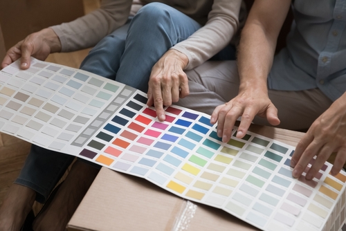
Different colors evoke different emotional and physical responses and, perhaps, especially so among certain people with disabilities. Maybe that’s why color therapy, also known as chromotherapy, has become an increasingly popular alternative wellness method. But beyond the walls of color-coded medical facilities and therapy centers, the concept of intentionally tapping into colors can easily be applied at home. So, grab a paint brush and coat your walls with the best paint colors for people with disabilities.
Warm Paint Colors for People with Disabilities
Red
Red may increase brain wave activity, heighten the perceived temperature of the room and, in some cases, raise heart rate and/or blood pressure. For some people, such as those with ADHD or other neurodiverse conditions, using red as a dominant color is not advised. According to data collected by the website Autism Key, 85% of children with autism spectrum disorder (ASD) report seeing colors with greater intensity than their neurotypical peers, specifically noting that red appears nearly fluorescent and vibrating with intensity. Thus, it’s best to minimize full intensity of all primary colors — red, yellow and blue — and opt for toned-down shades.
However, experts working with patients living with Alzheimer’s disease and related dementias (ADRD) found that red can be a helpful hue for this population. Red may be a good color to incorporate into kitchens as it can heighten the sense of smell and, therefore, stimulate the appetite. Furthermore, studies have shown that serving meals on red plates can increase appetite by as much as 33% in people with ADRD, according to the Alzheimer’s & Dementia Resource Center.
Orange
Orange tones, preferably muted rather than bright, may heighten joy, socialization and aspiration, with increased oxygen levels. However, more intense orange colors can be associated with danger, such as fire or hazardous materials (like medical biohazard boxes).
Yellow
Shiny and luminesce like the sun, yellow often stimulates creativity and optimism. Yellow walls and/or bold accent pieces may bring energy to a clinic or classroom setting, says Fun and Function, a site specializing in adaptive tools. And, for those with low-vision or color-blindness, yellow is a go-to for color contrast. Yellow pops well when paired with a darker shade.
On the flip side, however, a study found that children with ASD least prefer yellow. This strong hue can be overloading to some with sensory sensitivities, especially since, as previously noted, children with conditions like ASD perceive colors differently and more intensely. Other studies found that yellow can tire eyes, trigger anger and even cause babies to cry more.
Cool Paint Colors for People with Disabilities
Green
Color therapists say that green is a healing hue as it’s midway in the color spectrum and, thus, offers a balanced, calming feeling. Connecting to nature and the environment, green can lessen signs of agitation and stress. The International Journal of Progressive Education reported that children with ASD overwhelmingly favor green.
A cooler, muted shade of green can make a room seem larger, whereas a more vibrant shade like lime green can be an attention-grabber. Pops of lime green painted onto handles, knobs and even seats can provide an added layer of safety for those with ADRD or the elderly.
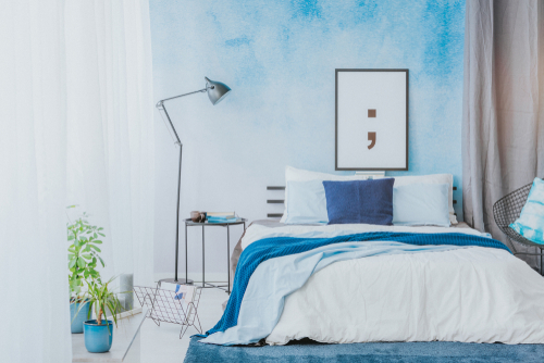
Blue
Blue is believed to lower anxiety. Maybe that’s why blue is often used in spaces dedicated to resting, like nap stations and reading nooks. Similarly to the color green, cooler hues of blue are more comfortable for most people compared to any shade of warmer (or hot) colors. Still, do opt for softer tones rather than darker blues which can ignite bluesy or sad emotions.
Blue is also associated with decreasing appetite so if you or a loved one has a condition exacerbated by weight gain, consider adding blue to kitchen or dining areas.
Neutral Paint Colors for People with Disabilities
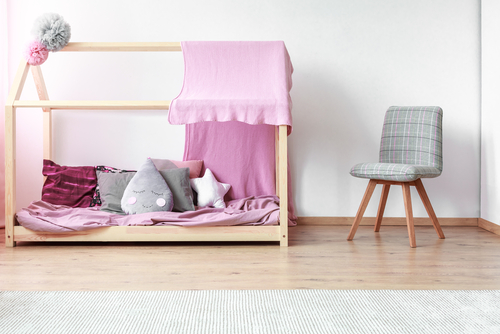
Pink / Purple
Pastel shades of pink and purple may stimulate feelings of love and safety. A soft lilac might help create a calming bedroom to better achieve relaxation. Meditation enthusiasts also tap into pale violets to stimulate focus, awareness and imagination.
Other Colors
Neutral colors such as beige, gray or other earth tones may also be fine paint colors for people with disabilities. Whereas, white and black are often too extreme.
In general, muted, cooler shades are favorable among people with disabilities. Do you think a fresh coat of paint could be beneficial for your (or your loved ones) emotional or physical wellbeing? You might just be tickled pink over the results!