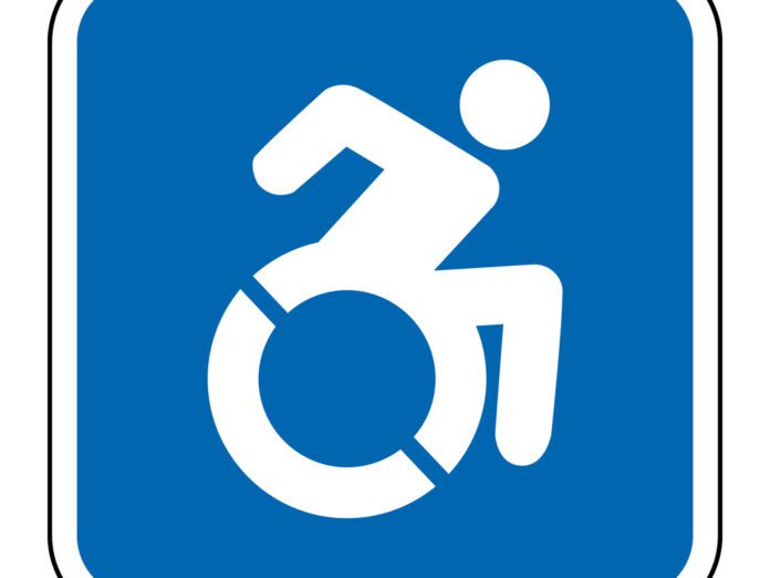
What does our environment teach us about disability? It’s a simple question with world-changing answers. Answering that question led a team down a controversial path, creating an icon that’s been both praised and rejected, acclaimed and banned.
It all started with a question—what does our environment teach us about disability? It was a question Sara Hendren started asking in 2006 when she had a son with Down syndrome. The question led her to drop out of her PhD program and start exploring what our environment says about disability culture.
Her biggest finding? The limitations of the Universal Symbol of Access, the blue-and-white icon many in the U.S. know as the “handicapped” or “wheelchair” symbol. Its history stretches back more than a half-century, but it wasn’t designed with the disabled in mind. As “disability” was becoming more widely recognized in the 1960s, it was time to create a single universal icon. Danish graphic artist Susanne Koefoed submitted the winning design—a headless stick figure sitting in a wheelchair. Unlike the soft, rounded limbs of other international symbols (think of those of men’s and women’s bathrooms), this figure was made of straight lines. The final version included a circular head to “humanize” it.
In the decades since, the Symbol of Access has served its purpose—it’s become an icon recognized the world over. But Hendren didn’t think it showed a positive view of disabilities, and she wanted to do better. She wanted to change the icon from a static, helpless wheelchair user to a human—a person in control of their life, who happens to have a disability.
The Makings of The Accessible Icon Project
Hendren partnered with philosopher Brian Glenney to start The Accessible Icon Project. But neither Hendren nor Glenney were designers, and their goal wasn’t just to create a new design. They wanted to start a conversation. And what better way to do it than with graffiti? So, about 1,000 copies of a semi-transparent orange decal were placed on “handicapped” signs around Boston in 2011. “We knew that editing the old signs as graffiti would pose questions more provocative than a ‘better’ icon,” Hendren wrote on the Accessible Icon website. But what started as a simple side project quickly snowballed into something much bigger.
When The Boston Globe picked up the story in 2011, Hendren and Glenney knew it was time to formalize their design. They partnered with professional designer Tim Ferguson Sauder to convert their concepts to a standardized format. They made it open source, meaning anyone could use the symbol for anything, no permission or payment required.
Today, the symbol has traveled the world, everywhere from signage at a hospital in New Delhi to the U.S. Treasury. It was added to the permanent collection at the Museum of Modern Art and mandated for new signage by New York State and Connecticut. It’s been covered by media outlets like The Huffington Post, The Verge, CNN, and the NPR program 99% Invisible. But perhaps the biggest cultural shift happened in 2015, when the symbol was adopted as part of Emoji 1.0 and included by default on Apple devices.
A Sign of Disability-Related Debate
But like any underground project with sudden mainstream attention, The Accessible Icon Project has faced growing pains. The ISO, the organization which maintains the current International Symbol of Access, has rejected the update. Legal concerns over the new icon’s ability to fulfill the requirements of the Americans with Disabilities Act has caused confusion for businesses.
Perhaps most importantly, some in the disability community have decried it, arguing that its use of movement or singular focus on wheelchairs do more harm than good. There’s also been criticism of the three-person team behind the project, all of whom are able-bodied.
In many ways, the controversy is what the symbol is meant to generate. The symbol isn’t meant to replace everything, but to start a conversation. Co-creator Ferguson-Sauder best summed up the movement in a 2018 interview. “Our symbol is most successful,” he said, “… when there’s lots of wrinkles and questions.”


